RE"SHAPING" INDOOR LACROSSE
The National Lacrosse League has a rich history of bold identities, unforgettable team names, and logos that defined different eras of the sport. This ongoing rebrand series revisits teams from the NLL’s past and reimagines their identities for today.
Each concept draws inspiration from the original team while introducing a modern visual system built for the current sports landscape. The goal isn’t to erase what made these identities memorable, but to evolve them by preserving their character, history, and connection to their cities through a new perspective.
BALTIMORE THUNDER
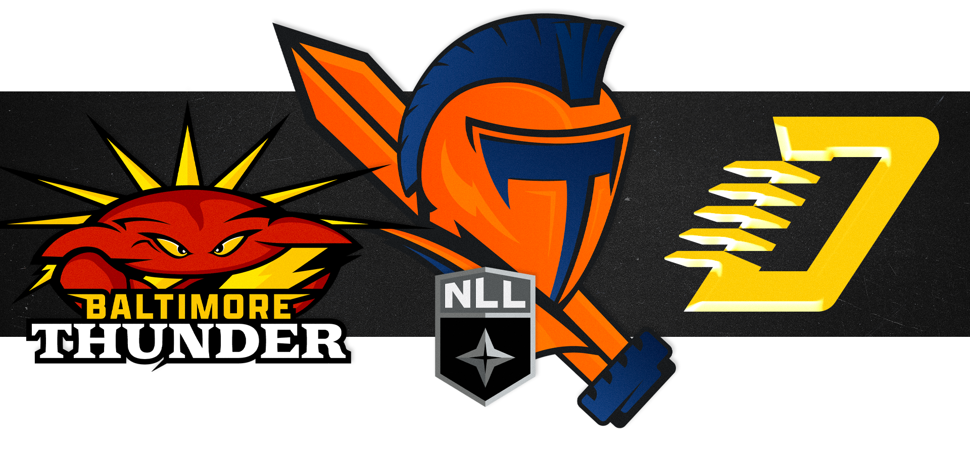
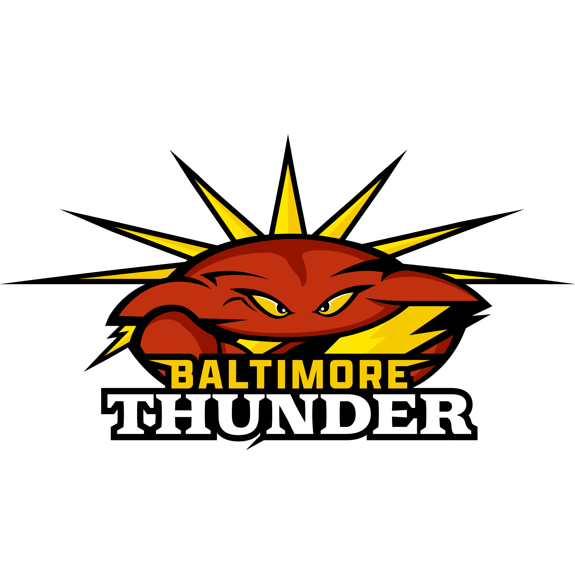
The Baltimore Thunder’s original identity captured the loud, high-energy personality of the franchise. For this rebrand, I wanted to preserve that same intensity while making the “Thunder” name more prominent within the mark itself. The concept merges the shape and movement of a powerful thunderstorm with a crab—a symbol deeply associated with Baltimore and Maryland—creating a single character that feels both regional and unique to the team. Sharp forms, aggressive movement, and storm-inspired details bring the two ideas together while maintaining the energy and attitude of the original Thunder identity.
ORLANDO TITANS
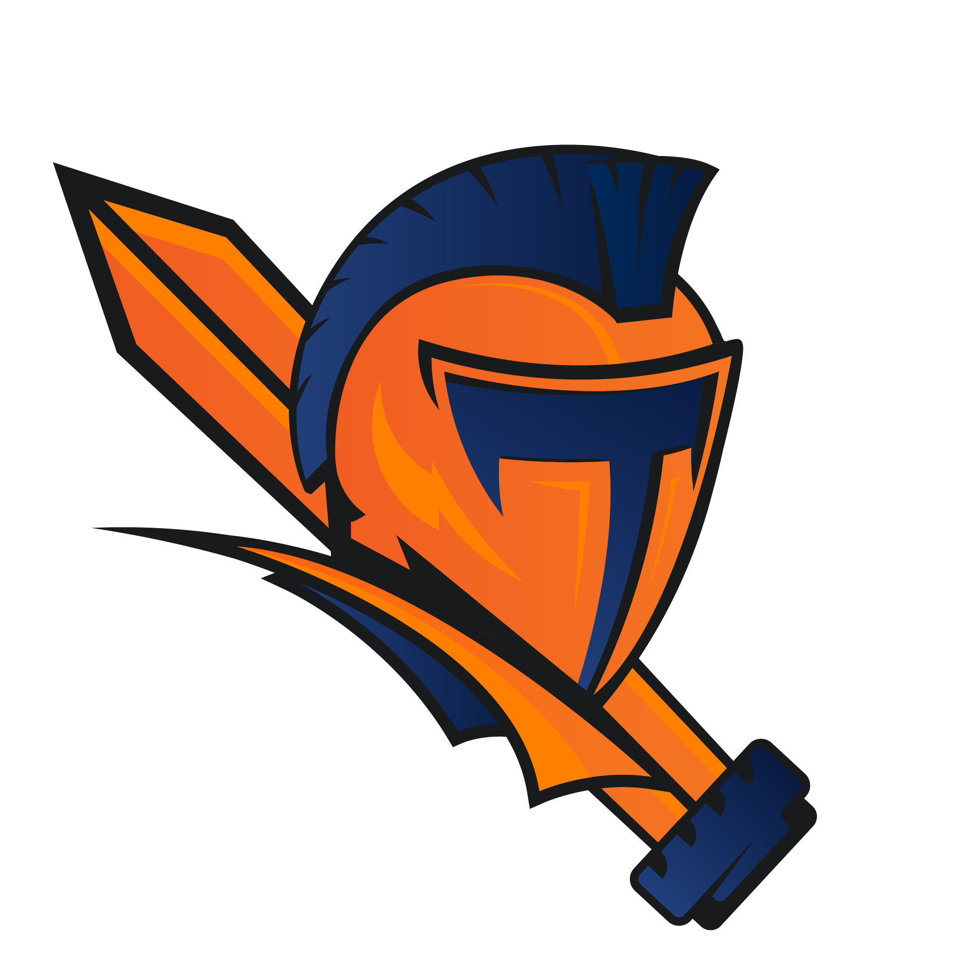
The Orlando Titans’ original identity centered around a traditional Titan helmet, but its straight-on composition left an opportunity to bring more movement and personality into the mark. For this rebrand, I reimagined the helmet from a more dynamic perspective, creating a stronger sense of motion, depth, and aggression. The updated forms give the Titan a more commanding presence while maintaining the recognizable helmet and warrior imagery at the core of the original identity. The result keeps the strength of the Titans name while giving the logo a faster, more energetic feel suited for the pace and physicality of lacrosse.