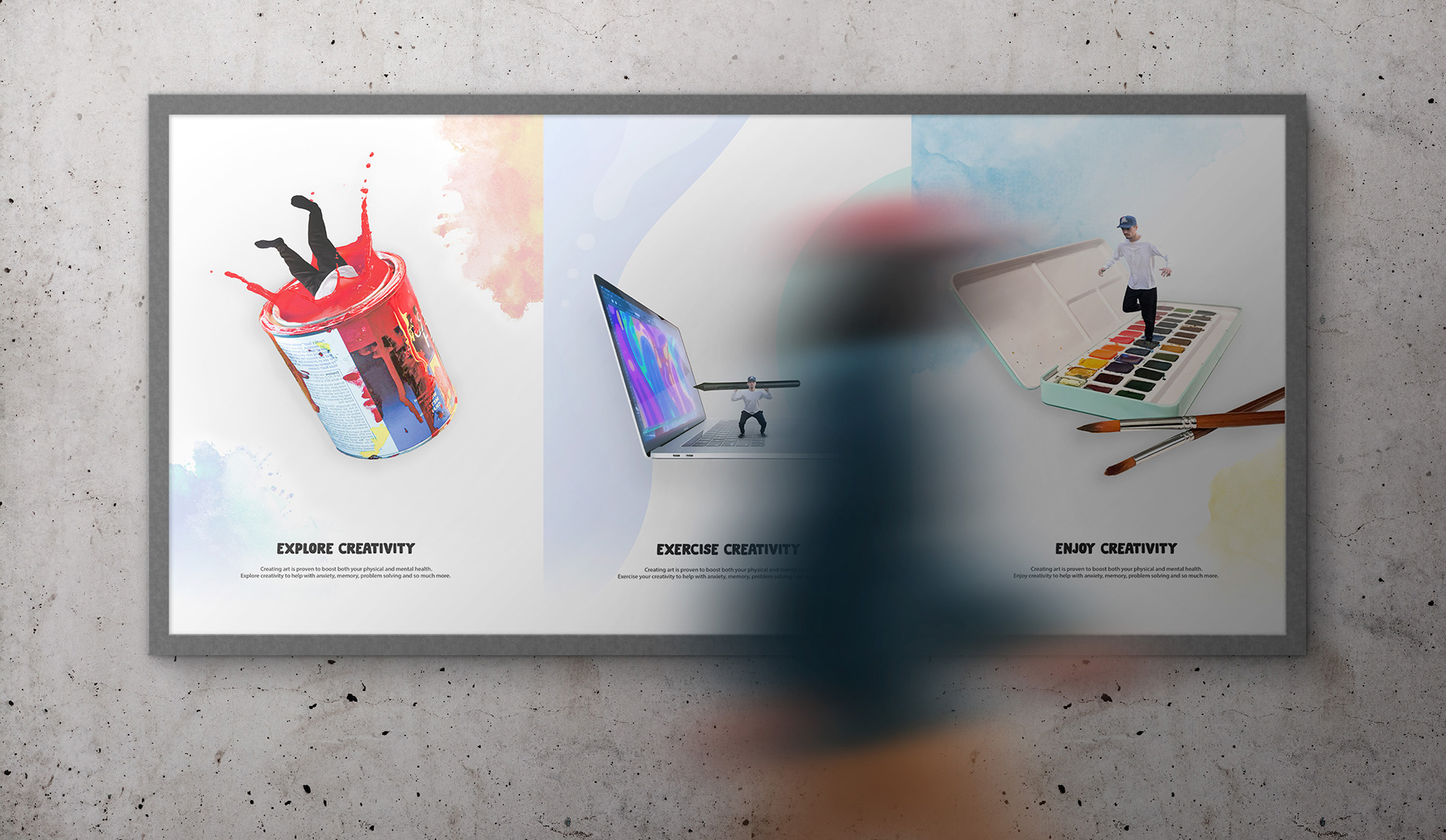

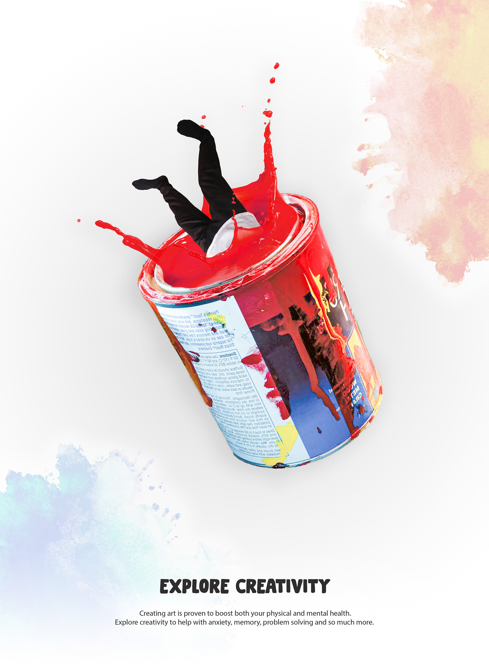

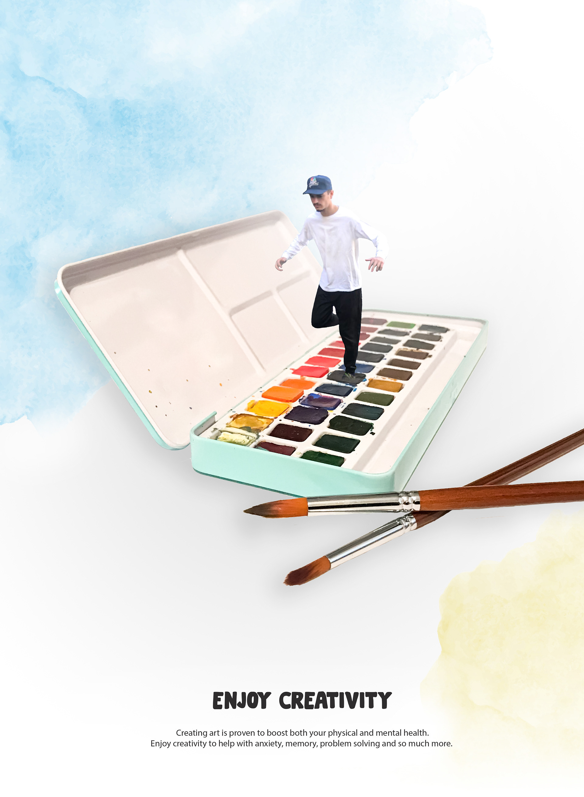
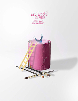
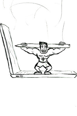
I created a series of posters that showed the importance of creativity in a human to life-size comparison. It was important to keep consistency between the copy, visual metaphors, scale, and positioning. The poster series displays a figure exploring creativity by diving into a paint can, followed by the figure exercising creativity by squatting a digital pressure brush, and lastly the figure playing hop-scotch on a watercolor palette, enjoying creativity.
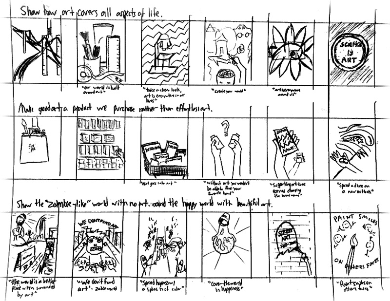
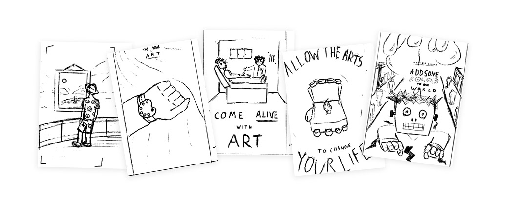
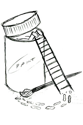
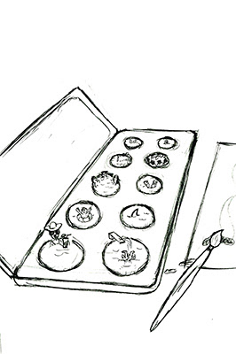
During the time I spent working on this project, I went through some struggles. I drew many thumbnail sketches, but I wasn’t feeling too strong on a certain idea. I liked some singular thumbnails, but making them a series was a difficult task. I then sketched out a human interacting with a large scale paint can and I immediately knew it would work as a series. I liked the idea of showing the importance of the arts by providing a fun way to see art in a life-size scale.
I mocked up my three favorite ideas to get an idea of what my compositions would look like. I received feedback from four of my roommates to see which one read the most clear. As a whole, the paint bucket one was the favorite, which I was happy with.
The Ad Campaign was my favorite project from class sophomore year. I enjoyed working with a series of compositions. I always enjoy collections of art that are different in their own ways, but portray the same message and are visually connected. I felt I had a lot of freedom when coming up with ideas, mocking them up, and finishing it up on the computer. It was pleasing to see my ad campaign printed, and hung for display. I gained a lot of knowledge throughout the process.